

Use Wozber and land your dream job
Create CV
No registration required
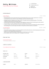
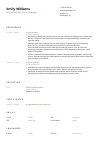
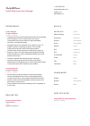
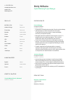
Weaving narratives with data, but your CV seems like an unscaled chart? Check out this Data Visualization Specialist CV example, created with Wozber free CV builder. Learn how to present your visualization prowess in line with job insights, making your career trajectory as clear as a well-designed infographic!

Data visualization work gets judged in a practical way. Can you turn messy analysis into charts, dashboards, and reports that business users actually trust and use? Hiring teams look for people who can shape the visual layer of decision-making, not just operate a dashboard tool. Your CV should make that visible through project scope, analytical depth, and the kinds of stakeholder questions your visuals helped answer.
For this kind of role, weak CVs often blur the line between general data analysis and true visualization ownership. A tailored CV clarifies where you designed interactive reporting, maintained data accuracy, and translated complex findings for non-technical audiences. Wozber's free CV builder helps organise that story in an ATS-friendly CV format, so the first scan surfaces your visualization tools, communication range, and ability to deliver reporting that supports better decisions.
The header section matters more than many candidates think. For a Data Visualization Specialist, it sets up your professional identity quickly and removes friction around location, contact access, and portfolio visibility before a hiring manager reaches your dashboards, reports, or BI work.
Use your full name in a clean, readable format at the top of the page. This section does not need design flourishes. In a role centered on clear visual communication, even your header should feel organised and intentional.
Place "Data Visualization Specialist" under your name when that matches the role you are pursuing. Mirroring the posting helps both ATS matching and recruiter review, especially when your past titles vary, such as Data Analyst or BI Analyst but your work has focused on dashboard design, reporting, and visual storytelling.
Add a phone number and professional email address that are easy to read and current. If someone wants to discuss a Tableau dashboard portfolio, stakeholder reporting experience, or a recent analytics project, there should be no delay caused by missing or outdated contact information.
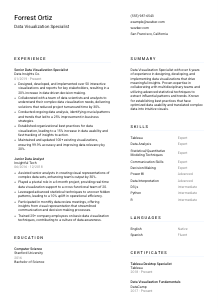
If a posting specifies a city or region, list it clearly in your personal details. Here, San Francisco, CA appears as a direct requirement, so including it removes an immediate question. Treat that as tailoring to this employer, not as a universal rule for every data visualization application.
A LinkedIn profile, portfolio site, or personal website is especially useful in visualization roles because employers often want to see finished dashboards, report layouts, or interactive work. Make sure the link is active and the content matches the tools and projects named on your CV.
Your personal details should answer practical questions fast: who you are, what role you do, how to reach you, and whether you meet any stated location requirement. That keeps the focus where it belongs, on your visualization work.




This is the section where hiring teams decide whether you have actually built and maintained visualization products, or only supported them from the sidelines. For Data Visualization Specialists, experience needs to show analytical judgment, tool fluency, business context, and measurable outcomes from the reports or dashboards you delivered.
Read the responsibilities closely and mark the verbs that define the job. In this case, that includes designing interactive visualizations, collaborating with analysts and data scientists, analysing trends, maintaining reporting accuracy, and setting visualization best practices. Those are the themes your bullet points should reflect.
List positions in reverse chronological order with job title, company, and dates. Emphasize roles where you owned dashboards, report development, data interpretation, or stakeholder-facing analytics. Even if an earlier title was "Junior Data Analyst," include it if the work involved visual communication and pattern analysis that led toward a specialist role.
Each bullet should connect what you built or analysed to what changed because of it. Good examples in this field mention dashboards launched, reports improved, turnaround time reduced, or business decisions supported. The sample CV handles this well with specifics such as 50+ interactive visualizations and a 30% reduction in project turnaround time.
Metrics carry real weight here because visualization work is often evaluated by adoption, speed, accuracy, and decision support. Use numbers tied to your work, such as reporting volume, stakeholder reach, refresh accuracy, reduced manual analysis time, or measurable changes in decision-making. The strongest figures are the ones that explain why the visual output mattered.
Save space for accomplishments connected to dashboards, BI tools, reporting workflows, data analysis, and stakeholder communication. If a bullet does not help explain your visualization scope, analytical contribution, or business impact, it is probably taking room from stronger material that does.
A hiring manager should be able to see the kind of reporting environment you worked in, the tools you used, and the decisions your visuals supported. When your experience section does that clearly, your fit for the role becomes much easier to judge.
Education is often a straightforward checkpoint for data visualization roles, but it still needs to support the story your experience tells. Degrees in computing, analytics, information systems, or related fields show that your visualization work sits on a foundation of data handling, analytical reasoning, and technical problem-solving.
If the posting asks for a bachelor's degree in Computer Science, Data Analytics, Information Systems, or a related field, list your degree exactly as awarded. Do not rename it to fit the posting. A closely related field still works if the rest of your CV shows relevant visualization and analytical experience.
Present education in an easy-to-scan order such as degree, field, school, and graduation year. Hiring teams usually review this section quickly, so clarity matters more than extra description unless you are early in your career or changing specialties.
When your degree aligns neatly with the requirement, let that alignment speak for itself. The example CV lists a Bachelor of Science in Computer Science, which fits the stated requirement well and reinforces the technical side of the candidate's dashboard and reporting work.
If you have limited professional experience, relevant coursework can help connect your education to the role. Prioritise classes or projects in data visualization, statistics, analytics, human-computer interaction, database systems, or quantitative modeling, especially when they involved tools, dashboards, or applied analysis.
Honors, research, or a capstone project can add value when they point to analytical rigor or communication through data. A thesis on data interpretation, a dashboard-focused final project, or strong work in statistical modeling is worth including. General awards without relevance can stay off the page.
Your education section should confirm that you have the technical grounding to work with data, interpret it well, and present it visually. Keep it concise, accurate, and tied to the level of the role you want.
Certifications are especially useful in visualization hiring when they back up the platforms and methods named elsewhere on the CV. They can strengthen your case if your experience already shows hands-on work in Tableau, Power BI, analytics, or related reporting environments.
If the job emphasizes Tableau, Power BI, D3.js, or analytical modeling, list certifications that reinforce those areas. Even when the posting does not require a certificate, one can help confirm platform-specific capability and ongoing professional development.
Lead with certifications tied to the tools or methods most likely to matter in the role. For this opening, a Tableau credential deserves stronger placement than a broad general course because the employer explicitly names major visualization platforms.
Add the year earned and, when relevant, the validity period. In software-heavy fields, dates help hiring teams see whether your credential reflects current platform knowledge or older training that may need updating.
Visualization standards, BI features, and stakeholder expectations change quickly. Ongoing learning in dashboard design, data storytelling, analytics, or data modeling shows that you are keeping pace with the tools and practices used in modern reporting environments.
A well-chosen certification section supports the rest of your CV with credible proof of tool knowledge and continued development. Keep the emphasis on relevance, recency, and real value for visualization work.
This section should read like a realistic toolkit for data visualization work, not a generic collection of software and soft skills. Hiring teams want to see whether you can move from raw data to usable visual output with the right platforms, analytical methods, and communication abilities.
Start with the posting and extract the required tools and capabilities. Here, that includes Tableau, Power BI, D3.js, data analysis, data interpretation, statistical or quantitative modeling, and strong communication. Those belong near the top if you genuinely use them.
Visualization specialists need more than software proficiency. Pair technical tools with the underlying work they support, such as dashboard design, reporting logic, statistical analysis, stakeholder presentation, and simplifying complex findings for business users. That balance reflects how the role actually operates.
Group skills logically or present them in a clear order of relevance. If you use proficiency labels, keep them honest and consistent. The sample CV works because it combines core tools like Tableau and Power BI with role-critical capabilities such as data interpretation and communication, giving a fuller picture of day-to-day effectiveness.
Your skills section should tell a reviewer that you can work with the right platforms, understand the data underneath them, and explain what the output means. That combination is what makes visualization work useful.
Language skills matter in data visualization when the role involves presenting findings, writing commentary, or working across teams with different levels of technical knowledge. This section should stay practical and support the communication demands of the job.
If the employer asks for spoken and written English, list English clearly with an accurate proficiency level. Communication is central to visualization work because dashboards and reports only help when people can understand the message behind the charts.
Order matters. Lead with the language the role explicitly requires so a recruiter or hiring manager can confirm it without searching through the section.
Additional languages can be useful when you present to varied stakeholder groups, support global teams, or work in customer-facing analytics environments. They are a bonus, not a replacement for the core communication requirement in the posting.
Use clear labels such as Native, Fluent, Intermediate, or Basic. Avoid vague wording. In a communication-heavy role, realistic proficiency levels are more helpful than inflated claims.
For a Data Visualization Specialist, language skills matter because they affect how well you explain metrics, write report context, and guide non-technical audiences through findings. If a second language supports that kind of work, it is worth listing.
This section should confirm that you can communicate clearly with the audiences your visuals are built for. In many teams, that matters almost as much as the charts themselves.
The summary is your chance to establish the kind of visualization specialist you are before the reader reaches the detailed sections. It should quickly connect your years of experience, tools, analytical strengths, and business impact in language that matches the role you want.
Before writing, identify the two or three themes the employer stresses most. Here that would be interactive visualization, analytical interpretation, and clear communication with stakeholders. Those themes should shape your opening lines and the achievements you reference.
Start with your professional title and years of relevant work. A line such as "Data Visualization Specialist with 6+ years of experience" gives immediate context and helps position you for the level of the role.
Mention the kinds of outcomes your work has produced, such as improving reporting accuracy, accelerating insight delivery, or increasing data-driven decision-making. The example CV does this effectively by linking visualization output to measurable business improvement instead of stopping at tool names.
Aim for three to five lines that capture your specialization without repeating the full experience section. Focus on the work you want to keep doing, such as building interactive dashboards, collaborating with analysts and data scientists, and translating complex datasets into clear visual narratives.
A sharp summary gives the reader a fast, accurate picture of your visualization scope and professional level. If it is aligned to the role, the rest of the CV lands with much more clarity.
A Data Visualization Specialist CV should make three things obvious within a quick review: the tools you can work in, the analytical depth behind your visuals, and the business decisions your reporting helped support. When each section is tailored around those points, your application reads like someone who can build dashboards people trust and use.
Use Wozber's AI CV builder to shape that content into an ATS-compliant CV, refine role-specific wording, and check alignment with an ATS CV scanner. The final version should make it easy to see that you can turn complex data into clear visual reporting from day one.