Use Wozber and land your dream job
Create Resume
No registration required
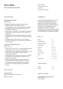
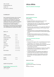
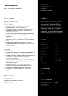
Slicing and dicing data, but your resume feels like it needs a graph? Check out this Data Visualization Developer resume example, created with Wozber free resume builder. It shows how to chart your coding prowess to match job requirements, making your career path as impactful and engaging as your visualizations!
Data Visualization Developer hiring usually turns on one practical question: can you take messy, high-volume data and turn it into dashboards and reports people actually use to make decisions? Resumes often mention tools, but the better ones show how those tools improved adoption, clarified performance trends, supported stakeholders, or made analytics easier to interpret across the business.
Screening gets faster when your resume makes your visualization stack, reporting work, and business-facing collaboration easy to trace. Wozber's free resume builder helps shape that content into an ATS-compliant resume, so skills like Tableau, Power BI, D3.js, Python, or JavaScript are matched cleanly to the role and hiring teams can quickly see where you have already delivered usable analytics products.
For a Data Visualization Developer, the header should do more than identify you. It should immediately confirm professional focus, reliable contact details, and any location requirement that affects whether your application moves forward.
Your name should be the most visible text in the header. Keep it easy to scan and professional. Hiring teams reviewing analytics and dashboard talent move quickly, so clean formatting helps them get straight to your role, tools, and project history.
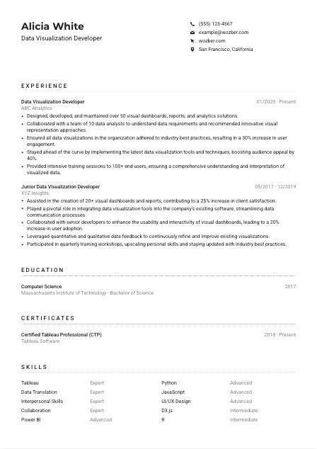
Place "Data Visualization Developer" below your name when that matches the role you are pursuing. This removes ambiguity, especially if your past titles vary across BI, analytics, or front-end reporting work. In the example, using the exact title immediately aligns the candidate with the opening.
Make it easy to reach you for interviews or portfolio follow-up. Double-check every character.
Sometimes location is a hard requirement, not a preference. Here, being based in San Francisco, California is explicitly requested, so listing that city and state helps remove an early objection. Treat this as tailoring to the posting, not as a standard rule for every Data Visualization Developer resume.
A LinkedIn profile, portfolio site, or project page can strengthen your application if it shows dashboards, reporting work, or interactive visualizations. Keep it current and consistent with your resume. For this profession, links are most useful when they show how you structure information, choose visual forms, and communicate findings.
This section should confirm who you are, where you can be reached, and whether basic requirements are already covered. Once that is clear, the rest of the resume can focus on dashboard delivery, visualization quality, and business impact.




Experience carries the most weight for this role because it shows whether you have built visual products that people relied on. Focus less on generic duties and more on the dashboards, reports, tools, user groups, and outcomes tied to your work.
Before editing your bullets, isolate the role's core asks. Here, that includes building dashboards and reports, working with stakeholders, using tools such as Tableau, Power BI, or D3.js, programming for visualization in Python, R, or JavaScript, and supporting end users. Those themes should appear across your experience in language that reflects what you actually did.
List your most recent role first, then work backward. For each position, show company, title, and dates without clutter. That structure helps reviewers quickly follow your progression from junior reporting work into owning visualization development, analytics delivery, or user-facing dashboard design.
Each bullet should show what you built, who used it, and what changed because of it. Useful details include dashboard volume, stakeholder groups, reporting cadence, data domains, usability improvements, or adoption metrics. The sample resume does this well with bullets such as designing more than 50 dashboards and training 100+ end users, which gives real scope to the work.
Numbers make dashboard and analytics work easier to understand. Quantify user engagement, adoption, reporting efficiency, dashboard count, stakeholder reach, training volume, or reductions in manual reporting. A bullet like "increased user engagement by 30% by applying visualization best practices" works because it connects design quality to a measurable result.
Prioritize experience tied to visual analytics, BI tools, stakeholder communication, accessibility, and data storytelling. If an older bullet is mostly about unrelated software tasks, rewrite it to emphasize reporting interfaces, front-end data presentation, or collaboration with analysts if that is true to your work. Every line should help the reader picture you building and maintaining useful visual reporting products.
A hiring team should be able to see the dashboards you built, the teams you worked with, and the value your visualizations delivered. When your experience section names the tools, scope, and outcomes clearly, your candidacy becomes much easier to move forward.
Education is rarely the deciding section for an experienced Data Visualization Developer, but it still matters because many postings set a degree requirement. Keep it straightforward and make the match easy to spot.
If the job asks for a Bachelor's degree in Computer Science, Information Systems, or a related field, present that information clearly. In the example, a Bachelor of Science in Computer Science aligns directly with the posting and removes uncertainty about academic background.
List degree, field, school, and graduation date in a simple format. This section should be easy to scan in seconds so attention can return to your dashboard work, coding skills, and analytics experience.
A degree in Computer Science, Information Systems, data analytics, or a similar field supports the technical side of visualization work, especially where scripting, data handling, or front-end logic are involved. If your degree title is adjacent rather than exact, the field of study can help clarify the connection.
If you are early in your career, add coursework, capstone projects, or research only when it supports the role. Topics like information design, human-computer interaction, data analysis, statistics, database systems, or interactive visualization can strengthen this section when professional experience is lighter.
Academic honors, scholarships, or meaningful extracurriculars can help if they point to technical rigor, presentation skills, or analytical problem-solving. For more experienced candidates, keep these brief so the resume stays focused on professional delivery.
This section only needs to confirm that you meet the academic baseline and, where relevant, that your training supports technical visualization work. Once that is established, your experience and skills should carry the argument.
Certifications are optional in many Data Visualization Developer searches, but the right one can reinforce platform depth and continued learning. They are most useful when they support tools or practices that already appear in your experience.
When a posting calls for Tableau, Power BI, or related visualization platforms, credentials in those tools can add useful context. A certification such as Certified Tableau Professional fits naturally here because it supports a core platform named in the job description.
Only include certifications that strengthen your case for visualization, analytics, accessibility, reporting, or adjacent technical work. A short, relevant list has more value than a long catalog of loosely related courses.
Dates show whether a credential is recent or actively maintained. That matters in a field where dashboard tooling, BI platforms, and best practices change regularly.
Data visualization standards evolve across interactivity, accessibility, storytelling, and self-service analytics. Updating this section over time shows that you are keeping pace with the tools and methods teams now expect, especially if your work involves training users or improving dashboard usability.
A certificate will not outweigh project work, but it can strengthen your platform credibility and show commitment to the craft. Keep this section tight and clearly connected to the tools and methods your resume already demonstrates.
The skills section should read like the toolkit behind your dashboards and reports. For this role, that usually means a blend of visualization platforms, scripting languages, data interpretation, and stakeholder-facing communication.
Pull the technical and collaborative requirements directly from the role, then include the ones you genuinely use. Here, that means tools such as Tableau, Power BI, or D3.js, plus Python, R, or JavaScript for data visualization work. Matching that language helps both ATS screening and human review.
Order matters. Put your strongest and most relevant capabilities first, especially the platforms and languages you would use in the target role. In the sample, Tableau, Power BI, Python, JavaScript, and D3.js all support the job description, while collaboration and data translation reinforce the business-facing side of the work.
Consider separating platform skills, programming languages, and collaborative strengths so the section is easier to scan. For a Data Visualization Developer, categories such as "Visualization Tools," "Programming," and "Communication and Stakeholder Work" often make more sense than one long mixed list.
Your skills section should quickly confirm that you can build the visuals, script the logic, and work with the people who depend on the output. When the list is relevant and well ordered, it supports everything your experience section claims.
Language ability is usually a supporting detail on a Data Visualization Developer resume, but it matters when the role includes training, stakeholder communication, or cross-functional collaboration. In this posting, English proficiency is explicitly required, so make that easy to find.
If the job asks for strong English speaking and listening skills, list English with an honest proficiency level such as Native or Fluent. That simple detail can matter for roles that involve requirements gathering, dashboard walkthroughs, and user training.
Additional languages can be worth including if they support work with diverse teams, clients, or user groups. They are secondary here, but they can still round out your profile when communication is part of the role.
Stick to standard terms like Native, Fluent, Intermediate, or Basic. Recruiters and hiring managers should not have to guess whether you can handle meetings, workshops, or support sessions in that language.
Many visualization roles involve presenting findings to non-technical audiences, answering stakeholder questions, or teaching teams how to use dashboards. If language skills support those responsibilities, they become more relevant than they would in a purely back-end technical role.
Only list languages you can comfortably use at the stated level. Inflating proficiency can become obvious quickly in interviews, stakeholder meetings, or training sessions.
For most candidates, this section is brief. Its job is to confirm required English proficiency and, when relevant, show added communication range that supports stakeholder-facing analytics work.
The summary needs to establish your value fast. For a Data Visualization Developer, that usually means combining platform expertise, business communication, and a record of building visual analytics that people can actually use.
Start by identifying the few themes that define the job most clearly, such as dashboard development, visual storytelling, stakeholder collaboration, and translating complex data into understandable views. Those ideas should anchor the summary instead of generic claims about being results-driven or detail-oriented.
A direct first line works well here. Something like "Data Visualization Developer with 4+ years of experience" immediately establishes relevance. The example summary does this effectively and then moves into the type of work delivered.
Include two or three of the most relevant platforms, languages, or capabilities, then connect them to actual outcomes. Tableau, Power BI, D3.js, Python, or JavaScript are useful to mention when they reflect your background. Pair them with strengths like improving dashboard adoption, clarifying decision-making, or training end users.
Aim for a short paragraph that can be read in under half a minute. Focus on experience level, visualization focus, core tools, and one or two business outcomes. That gives the reader a fast, credible picture of your value before they move into the rest of the resume.
Your summary should quickly tell a hiring team that you can turn data into clear, usable visual products and work effectively with the people who rely on them. When it is specific and role-aligned, the rest of the resume lands with more force.
A Data Visualization Developer resume should make three things clear within seconds: the tools you use, the dashboards or reports you have built, and the outcomes those visualizations improved. If those elements are easy to find, the resume is already doing important work for you.
Use Wozber's free resume builder to organize that experience into an ATS-friendly resume format, align your wording with the posting, and tighten section-level ATS optimization before you submit. The finished resume should make it easy to judge your ability to build visual analytics that teams can trust and use.