Use Wozber and land your dream job
Create Resume
No registration required
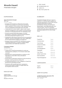
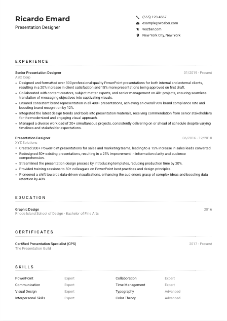
Crafting slides, but your resume lacks visual appeal? Check out this Presentation Designer resume example, created with Wozber free resume builder. Learn how to present your creative flair and storytelling skills in a way that matches job needs, ensuring your career story shines as boldly as your keynote graphics!
Presentation design sits at the intersection of visual craft and business communication. Hiring teams want to see that you can take dense content, data-heavy slides, or executive talking points and turn them into presentations that are clear, polished, and on brand. Your resume should make that ability visible fast, especially through the way you describe PowerPoint work, stakeholder collaboration, and the results your decks helped achieve.
A tailored resume changes how quickly your strengths register in both ATS screening and human review. When your wording mirrors the language of the role, such as presentation design, brand consistency, data visualization, and cross-functional collaboration, Wozber's free resume builder helps you shape an ATS-compliant resume that surfaces the right experience early. That makes it easier for a hiring manager to see whether you can handle the pace, polish, and messaging demands of presentation work.
Presentation designers are expected to communicate clearly before anyone even opens a portfolio. The top of your resume should look orderly, current, and easy to scan, with contact details that support a smooth handoff to interviews, portfolio review, and client-facing discussions.
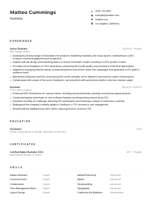
Put your name at the top in a clear, readable style. For a presentation designer, that choice quietly reflects your eye for hierarchy and spacing. You do not need decorative formatting here. A simple header that feels intentional is enough to show visual discipline.
Place "Presentation Designer" directly under your name if that matches your target role and recent experience. This keeps your positioning immediate and consistent with what hiring teams are scanning for. If your current title is broader, such as Graphic Designer or Visual Communications Designer, use the resume headline to clarify your presentation focus.
List a reliable phone number and a professional email address. Presentation designers often work across internal teams, executives, and client-facing groups, so your contact section should feel business-ready. Avoid casual email handles and double-check every detail before sending your resume.
If the role includes a location requirement, reflect it plainly. In the example, "New York City, New York" aligns with the employer's stated preference and removes a common screening question early. If you are relocating, state that clearly rather than leaving the employer to guess.
For this profession, a website or portfolio link matters more than it does in many other fields. Make sure it opens to presentation work, not a scattered collection of unrelated design pieces. Show decks, slide systems, data-heavy examples, and branded presentation samples that reinforce the same strengths named in your resume.
This opening block should confirm that you are reachable, professionally presented, and already aligned with the basics of the role. For a presentation designer, even these small details reflect judgment, structure, and audience awareness.


This is where hiring teams decide whether you can handle real presentation work under real deadlines. They are looking for volume, quality, brand consistency, collaboration with content owners, and signs that your decks improved understanding, approvals, or audience response.
Shape your bullets around the core work of the target role: designing decks, formatting slides, translating complex information, supporting events or client presentations, and working with stakeholders. The example does this well by leading with high-volume PowerPoint production and tying it to client satisfaction and first-draft approvals.
List jobs in reverse chronological order so the most relevant presentation design work appears first. If your latest role includes executive presentations, conference decks, sales presentations, or company-wide communications, give that experience the most space. Recent work usually carries the most weight because tools, design standards, and stakeholder expectations change quickly.
Avoid generic lines like "responsible for creating presentations." Show what changed because of your work. Strong bullets mention clearer messaging, faster production, stronger brand consistency, better audience comprehension, or smoother approval cycles. In the sample resume, redesigning 50+ presentations and improving information clarity by 25% gives hiring teams a much better read on performance than a task list would.
Metrics work especially well in presentation design when they reflect scope and business effect. Good examples include number of decks produced, simultaneous projects managed, reduction in turnaround time, approval rates, training delivered, audience comprehension gains, or stakeholder satisfaction. The sample's figures, such as 300+ presentations and 20+ concurrent projects, give concrete scale to the work.
Prioritize experience that shows slide design, visual storytelling, template creation, brand stewardship, Adobe support work, and collaboration with subject matter experts or leadership teams. If you have broader design experience, keep only the parts that strengthen your case for presentation design. Every bullet should help the reader picture you building decks that are polished, accurate, and ready for high-visibility use.
Your experience section should show that you can turn content into presentation assets people actually use, approve, and present with confidence. Focus on scale, stakeholders, visual problem-solving, and the business value behind the slides.
Presentation design is a practice-driven field, but education still helps explain your grounding in layout, typography, visual communication, and information design. Keep this section concise and relevant, especially if your degree supports the design judgment your portfolio and experience already suggest.
List the degree that best supports your design background first. A qualification such as a Bachelor of Fine Arts in Graphic Design is directly relevant because it points to training in composition, hierarchy, color, and visual communication. The example works well because the degree immediately supports the role's emphasis on design principles.
Present your school, degree, field of study, and graduation year in a clean format. Presentation designers are expected to organize information clearly, and this section should reflect that same discipline. There is no need for extra description unless a course, concentration, or project is unusually relevant.
If your education is in graphic design, visual communication, digital media, or a related area, keep that field visible. If your degree is less directly related, use your experience and portfolio to carry more of the weight, while still listing the education clearly. The hiring value here comes from showing a credible design foundation, not from overexplaining.
Early-career candidates can include a few details about presentation-related coursework, editorial design, typography, data visualization, or branding projects. If you already have several years of presentation design experience, those details are usually optional. Keep them only if they sharpen your story for the target role.
Awards, design exhibitions, leadership in student design groups, or major capstone projects can help if they connect to visual storytelling or client communication. Keep this short and relevant. The education section should support your design credibility, not compete with your portfolio or work history.
Use this section to confirm the visual and communication fundamentals behind your work. For a presentation designer, that usually means showing a design-related education background without letting it overshadow professional results.
Certifications are not always mandatory in presentation design, but the right ones can reinforce specialization in slide communication, software proficiency, or advanced visual storytelling. They are most useful when they add context that your degree or job titles do not fully cover.
List credentials that support the actual demands of the role, such as presentation design, visual communication, PowerPoint expertise, or related Adobe workflows. A certification like "Certified Presentation Specialist (CPS)" fits naturally because it connects directly to the profession rather than to general design knowledge.
Lead with the certification most relevant to the job you are targeting. Hiring teams do not need a long list if only one or two credentials clearly support your presentation work. Relevance matters more than volume.
Design tools and presentation standards evolve, so dates can show that your knowledge is current. If a certification is active, renewed, or held over several years, note that clearly. In the sample, the ongoing date range helps show continued relevance.
If you pursue more learning, prioritize areas that improve the work employers actually need, such as data visualization, brand systems, storytelling for business presentations, or advanced PowerPoint production. The best certifications strengthen what shows up in your decks, templates, and stakeholder-facing materials.
Use certifications to reinforce your specialization, not to pad the page. For presentation design roles, the most helpful credentials are the ones that support better deck quality, clearer messaging, and stronger command of the tools behind the work.
A presentation designer's skills section should read like a practical toolkit, not a catch-all list. Hiring teams expect to see slide software, visual communication strengths, and the collaboration skills needed to turn rough content into polished decks under deadline.
Start with the software and craft skills the role calls for. For this position, that means PowerPoint, presentation design software, typography, color theory, and Adobe Creative Suite. If you also work in areas like data visualization or template systems, include them when they reflect real experience and support the type of decks you build.
Presentation design is rarely solo work. You need hard skills such as layout, brand application, and visual storytelling, alongside communication, collaboration, and time management. The sample skill list is strongest where it combines PowerPoint and visual design with communication and interpersonal skills, because that matches how presentation projects actually move.
Do not overload this section with every design term you know. Prioritize the skills that map directly to the role and repeat language that appears naturally in the job description. Wozber can help tighten this into an ATS-friendly resume format so key terms like PowerPoint, Adobe Creative Suite, data visualization, and brand consistency are easy to find without sounding forced.
Your skills list should make it obvious that you can build polished presentations, work within brand systems, and collaborate with demanding stakeholders. Choose skills that reflect the actual software, design judgment, and workflow discipline the job requires.
Presentation designers often work with executives, sales teams, subject matter experts, and event stakeholders, so language ability can matter beyond basic communication. If a role specifies spoken and written English, your resume should confirm that requirement clearly and honestly.
List English first when the job specifically requires strong spoken and written English. In presentation work, that matters because you may need to interpret content drafts, clarify messaging, edit slide copy, and respond to stakeholder feedback with precision.
Additional languages can strengthen your profile when teams work across regions, support multilingual audiences, or produce client-facing materials in more than one market. The example's Spanish fluency is a good supporting detail because it adds range without distracting from the core qualification.
Describe your level clearly with labels such as Native, Fluent, Advanced, or Conversational. Overstating language ability creates problems quickly in a role where meetings, revisions, and written slide content may all depend on precise communication.
If you have worked on translated decks, international event presentations, or regional sales materials, your language section becomes more than a bonus. It supports the practical reality that presentation designers sometimes adapt content for different audiences and communication styles.
Only include languages you can use in a professional setting. For presentation design roles, the real value comes from being able to discuss content, review wording, and help shape messages for different audiences, not from listing casual familiarity.
Handled well, the languages section adds practical context about communication range. For this field, it is most valuable when it supports stakeholder collaboration, content clarity, or multilingual presentation work.
Your summary should quickly tell the reader what kind of presentation designer you are, how much experience you bring, and what kind of work you handle well. In a few lines, connect visual design ability with business communication outcomes so the employer understands your value before reading the full resume.
Read the job description closely and identify the few themes that matter most, such as PowerPoint expertise, turning complex ideas into clear visuals, brand consistency, and collaboration with cross-functional teams. Those themes should shape your wording more than generic design language.
Start with your title, years of experience, and primary area of strength. A line like the example's opening, which establishes more than 7 years in presentation design, works because it immediately sets professional level and specialization. Keep the first sentence direct and role-specific.
Use the summary to mention the kinds of outcomes you are known for, such as producing high-quality PowerPoint decks, translating complex information into understandable visuals, or maintaining brand consistency across large presentation volumes. Pull from experience that matches the target role rather than trying to summarize your whole career.
Aim for a summary that takes up three to five lines and avoids broad claims. Every phrase should earn its place by pointing to software strength, design judgment, stakeholder collaboration, or communication impact. If Wozber's AI resume builder helps you refine phrasing and align it with the posting, use that support to make the summary tighter and more role-specific.
By the end of these first lines, the employer should already understand your level, your specialty, and the kind of presentation work you do well. That gives the rest of the resume a clear frame.
A presentation designer resume works best when it shows how you handle both design craft and communication pressure. Use your experience to show deck volume, stakeholder range, brand discipline, and the ability to turn complex material into slides that people can actually present with confidence.
Before you apply, check that the language across your summary, skills, and experience matches the posting closely and stays easy to scan in an ATS-friendly resume format. Wozber's free resume builder, ATS resume scanner, and ATS-friendly resume templates can help you tighten that alignment and present your work clearly. The finished resume should make your presentation judgment, software fluency, and delivery reliability easy to see.